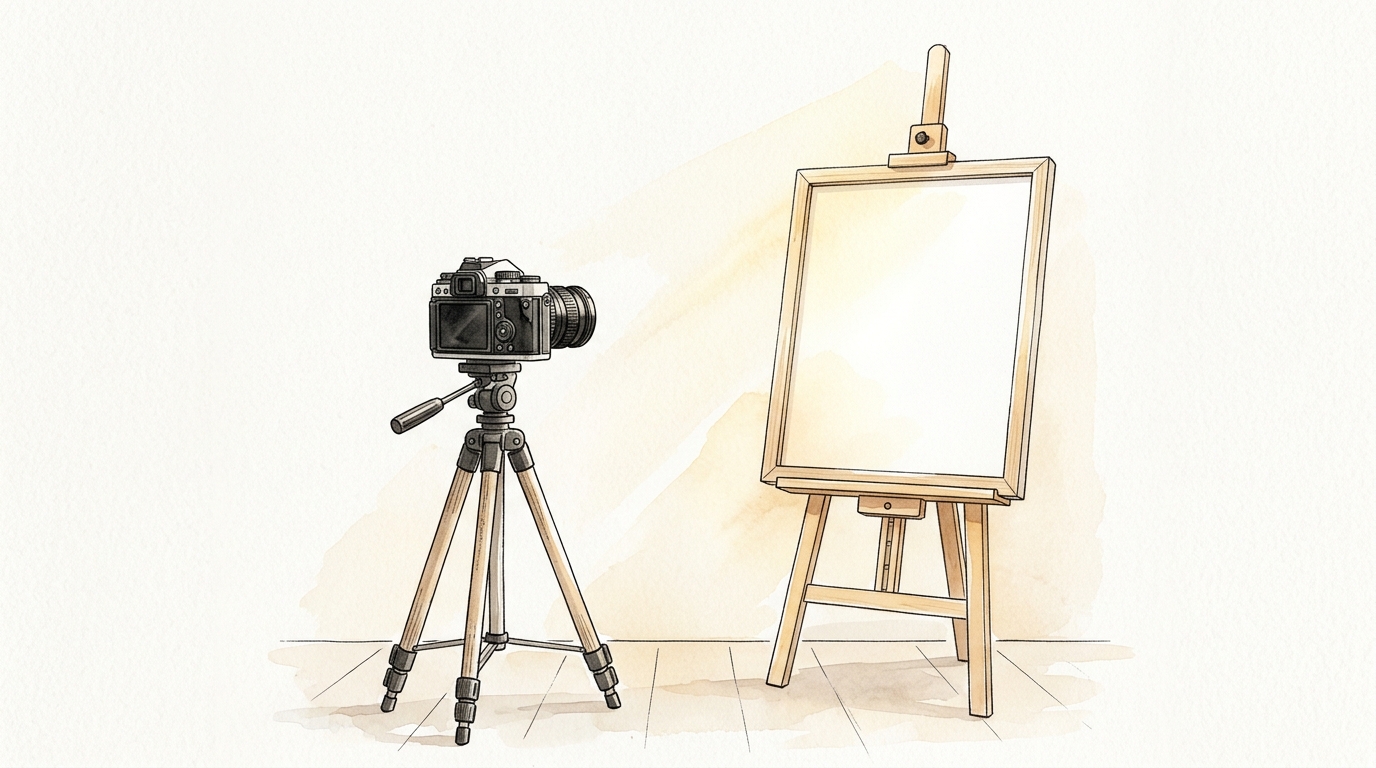
1. The Rules of Studio Lighting
When photographing fine art, your primary goal is to eliminate glare, hotspots, and shadows while maintaining color accuracy and texture.
The Golden Standard: Natural, Diffused Daylight. The cheapest and most effective lighting source is shooting outdoors on a bright, overcast day. An overcast sky acts as a massive softbox, casting even, neutral-colored light across your canvas. If shooting indoors, position your easel at a 45-degree angle next to a large window, utilizing a white foam-core board on the opposite side to bounce light back and fill in shadows.
⚠️ Photography Warning: Never use a camera's built-in flash. It creates a harsh white hotspot in the center of your painting and leaves the edges dark and distorted. Turn off all overhead room lights (tungsten or fluorescent) to prevent yellow or green color tints.
2. Aligning Camera and Canvas
Perspective distortion occurs when your camera lens is not perfectly parallel to the surface of the painting. This causes the painting to look trapezoidal, with one side appearing larger than the other.
To align your camera:
- Use a Tripod: You cannot shoot sharp fine art photos holding the camera by hand. Any micro-shakes will blur details and reduce sharpness.
- Center the Lens: Adjust your tripod height so the camera lens is aligned exactly with the horizontal and vertical center of your artwork.
- Grid Mode: Enable the grid lines option on your camera or smartphone. Ensure the outer borders of the painting align perfectly with the grid lines.
3. White Balance and Color Matching
Collectors expect the painting that arrives in the mail to look identical to the image on their computer screen. If your listing image has incorrect colors, you will face high return rates and damage your credibility.
To guarantee color accuracy:
- Use a White Balance Card: Place an industry-standard gray card or a sheet of matte white paper next to your artwork. Take a test photo including the card. In your editing software (Lightroom, Photoshop, or free mobile editors), use the eyedropper tool to click the white balance card—this automatically adjusts color temperature to match reality.
- Post-Processing: Crop your primary listing photo tightly to the canvas edge. Slightly adjust exposure and contrast to represent the texture and depth of the paint. Do not adjust the saturation slider; this creates artificial neon tones.
- File Formatting: Save your images as sRGB JPEG files. Most browsers and online galleries render colors using the sRGB profile. Saving in AdobeRGB or ProPhoto profiles can cause colors to look washed out on the web.
4. Listing Photos Checklist
Required Gallery Photos
- ✓Primary Shot: Flat, cropped front shot of the artwork canvas.
- ✓Texture Close-Up: A detailed macro photo displaying brushstrokes or signature details.
- ✓Scale Mockup: A photo of the artwork styled on a wall above a couch or table.
- ✓Back View: A photo of the back of the frame, showing the wire hanging hardware.
Once you have captured the perfect set of photos, you must upload them to multiple galleries. Instead of uploading separate image files to five different platforms, use OnlineGallery.com. Upload your high-resolution images once to your secure database, catalog metadata, and keep your entire multi-channel inventory coordinated from a single dashboard.
Store Your High-Resolution Art Catalog
Maintain a secure cloud archive of your professional artwork photos and catalog details. Track where they are listed and update descriptions instantly.
Get Started Free